May 10th, 2018
The more you look the more you see… redesigning a brand’s asset
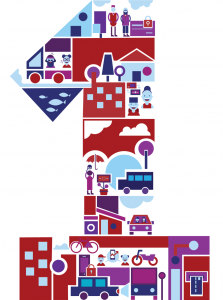
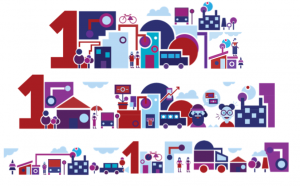
The redesign shows the diversity and different cultural backgrounds of both internal and external customers.
It’s #ThrowbackThursday and I’d like to feature a design project our sister agency Image & Time worked on in 2017. It was to redesign an element of a financial institutions brand asset.
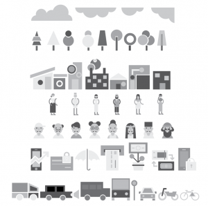
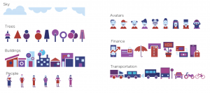
How would we redesign a brand asset without diluting its essence, it was important to keep the geometric shapes and vibrant colours, which were the main focal point as-is. The configuration of the geometric pieces appear abstract and not in a particularly thoughtful way. You would look at it and like it (perhaps) but very little else. We wanted almost to create a collage of short stories speaking on the Nigerian experience – the hustle of the city, the simplicity of the village. Hence it became important to create more intentional patterns and objects that could fit together to create something greater than itself. Still maintaining the basic forms and shapes inspiration, icons were created. These new identifiable symbols become the central element of brand – creating stories with each configuration, these dynamic geometric elements work like a game and are constantly changing. Customers can create their own narrative.
Next stop was the colour palette. We wanted it youthful but not young. Something about the current palette was a little too childlike and took away from the seriousness of the financial sector. We eliminated the bright sunny yellow and lime green but kept the iconic burnt red of the brand. Then we began to tweak the hues to create a stronger more streamlined colour palette. Blue was the next obvious choice with all of its psychologically positive attributes. Explorations of colours in-between the red and blue showed purple having real strength and power when used in conjunction with shades of blue. To further communicate the ease and sophistication of the brand, specific tones of lighter blue were used to create an airy, lighter, and more accessible feel.
![]()
And now we play….